
In defence of Comic Sans
If a font walked into a bar, it would be Comic Sans. The proverbial butt of all graphic design jokes, Comic Sans somehow manages to do the impossible and unify all designers as the one piece of design we all hate. Alongside Papyrus (see: SNL skit), it only takes a quick Google search to discover how much design humour is targeted towards mocking this one font. In our world of clean modern grids, increasingly simplified logos and rule-breaking typography, Comic Sans looks, well, comical. And as it should be.
Initially designed by Vincent Connare, Comic Sans was created as a typeface for Rover, a cartoon dog on a program called Microsoft Bob. It was inspired by the typefaces used for comic books and provided an alternative design choice for the ‘speech’ of a cartoon dog. As it was famously said, “dogs don’t speak in Times New Roman”.
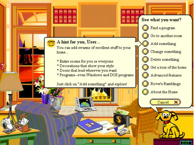
Image: Microsoft Bob and Rover (who doesn’t speak Times New Roman).
In that sense, arguably Comic Sans fulfilled its purpose and does what design does best: it solved a problem. So why do we hate it so much? Some theories blame usage error, like when Donald Trump’s lawyer famously used it in a letter to the court, as the reason for such collective dislike. In our everyday lives, we have seen Comic Sans being abused from lost pet posters and notices on shopfront windows to being used as the official signage on a multi-storey student accommodation.

Image: Col James Student Accommodation in Redfern which uses Comic Sans(!) as it’s official building typeface
So maybe we designers hate it because it’s just been taken out of context, right? Even so, I find it hard-pressed to imagine many designers selecting Comic Sans, even if they were on the hunt for a legible, childish font. I can almost hear the designer critiques and reasoning; “the font has poor visual weight which makes it difficult to read” or “poor letter fit that makes it virtually impossible to kern”.
So why am I trying to convince any designer to give some praise (ok, any defence) towards Comic Sans when I’ve also cringed at its use and design? Well, the truth is I have a small soft spot towards Comic Sans and I would argue, you may secretly have one too.
To bring you into context, I’m a 90’s kid. I grew up with dial-up internet, saving files across multiple floppy disks and computer games on CD-ROMs. I went from one day preparing for presentations handwriting sentences with markers on pieces of cardboard to tapping on a keyboard into a Microsoft PowerPoint. I can still remember opening PowerPoint for the first time and marvelling at the pre-designed templates we were allowed to select. And as soon as my eyes landed on it, I knew it was THE ONE. There were crayons (or were they pencils?) and bullet points that looked like tick boxes. More importantly, the font was Comic Sans.

Image: Memories of the infamous Crayon template in Microsoft PowerPoint (Source: Slideshare Dave Jay Manriquez)
This theme is burned into my memory as the awakening of a mild obsession with fonts which would later be classified as the world of typography – a core foundation of graphic design. If we went back to my student scholarship portfolio (unimaginatively themed ‘connecting the dots’ after the infamous Steve Job’s Stanford address), this would have been labelled my first dot. The colourful crayons paired with this fun font changed how I saw design. To my child’s mind, I didn’t know that fonts could be like this – not “boring” like Arial or god forbid, Times New Roman. Instead, there could be character! Did I want a line across a page with dot points in Georgia or a wave gradient paired in Garamond? Of course not! Why choose that when there was something way more visually interesting and playful?
And bringing it back to the seeming abuse of Comic Sans usage we see - I think it’s exactly that same spark many others like myself had that caused such a prolific (and admittedly, terrible) use of this particular font. In the world of stuffy serifs, it was approachable, legible and…different. Of course, this is just my opinion and my memories in the context in which I grew up. But I would implore all designers to think back to before your ‘education’ into design. Was it seeing a typeface, or style of handwriting that really piqued your curiosity and made you think ‘hey, that’s unusual…and I like it’? We may look back on it with slight embarrassment – heck, I could add Bradley Hand, Viner Hand and every font used within the pages of the Baby Sitters Club diary entries to my childhood list! – but I wouldn’t want to forget or dismiss them. Because if you’re anything like me, I almost guarantee you that it wasn’t the Baskerville, Garamond or Helveticas’ that first sparked our excitement for the nuances of typefaces. Instead it was the Curlz, Tempus Sans and Kristens – and even Comic Sans - so for that, we should give them praise (ok, defence).

Stacey McGill’s handwriting in the Baby-Sitters Club. (Source: LA Review of Books: Interview with Hollie Tommasino aka my BSC handwriting design hero!)