
Challenge:
Merchr is a UK-based merchandise company, known for print-on-demand services so that anyone can participate in creating and selling their designs. They also offer design services to companies who are looking to increase their brand awareness and engagement through merchandise opportunities. Three briefs were set as part of an application process, testing creativity, versatility and also a clear rationale behind the design thinking for a diverse range of potential projects.
Solution:
For each project, a target audience and general brief was supplied but the rest was open to interpretation, including the type of merchandise selected. Using this information was crucial in setting up the art direction and rationale for design decisions which included the purpose of the merchandise, environmental impact, adaptability and ultimately, what would make sense to sell.
BRIEF ONE -
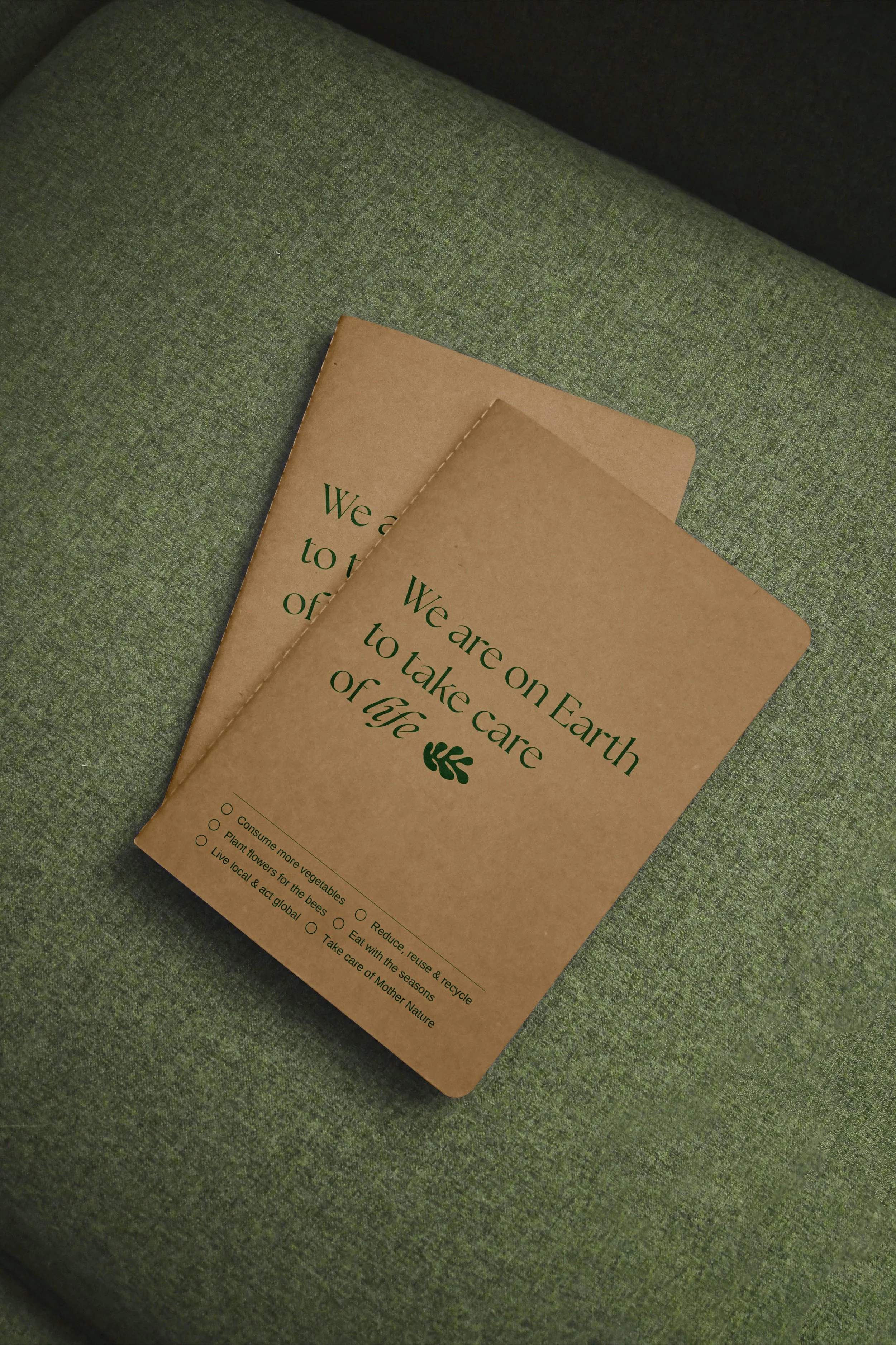
EnvironmentAL Awareness
For this brief, the requirement was to create a design that focused
on environmental awareness and utilised a motivational quote
to inspire behaviour.
The design was intentionally kept simple, allowing the attention to focus solely on the copy to create impact. The choice in typography reflects the desire to have a premium and sophisticated feel, with a small leaf motif as a nod to Matisse, an artist who also felt inspired by nature. The art direction was underpinned by the understanding that often it is the design aesthetic that a customer is drawn to first before considering sustainability credentials.
Given the purpose of the merchandise was about sustainability, the design was also kept minimalistic using only a single colour and reducing amounts of ink printed on the bag. Likewise, keeping the canvas bag and the paper of the notebook covers in their natural state instead of dyeing it with another colour was considered to remain consistent with the environmental messaging.


Primary design
Adapted design for one half of a two-notebook set focusing on individual contributions to sustainability

Adapted design for one half of a two-notebook set focusing on community and collective action

BRIEF TWO -
Retro Summer Pool party
The Summer Pool Party was inspired by the groovy nature of the seventies, drawing on the organic, free-flowing shapes and distinctive colour palette. To reflect the summer sunset and make it relevant for modern audiences, the vibrant and saturated colours of pink, yellow
and orange were used.
A key illustration was primarily used as the backdrop for the theme, in which key elements such as the pink flamingo floatie, sun rays and retro water pattern could be flexibly used across a range of merchandise as a character icon or background patterns. In keeping with the theme, a beach towel and t-shirts were chosen to showcase the designs.


BRIEF THREE - MUSIC FESTIVAL
The brief was to design a music festival that incorporated abstract patterns and vibrant colours. The design was inspired by the sounds of the particular music genre, in this case jazz, with the patterns and abstract shapes reflecting the diversity of sounds and instruments. From the fluid roll of the saxophone (i.e. - organic shapes) to the sharp staccato of a tapping cymbal (i.e. – triangles), the designs mimic the mish-mash of jazz in a playful manner. The design also creates a flexible system where patterns and colours can be re-arranged to create new designs for merchandise.
Bright foundational colours of yellow, red, green and blue were chosen to appeal to a broad cross-section of society as the jazz festival was a family-friendly event.


